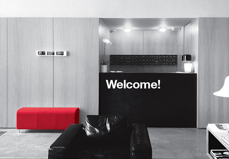
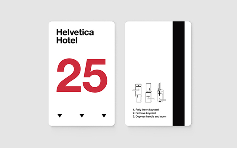
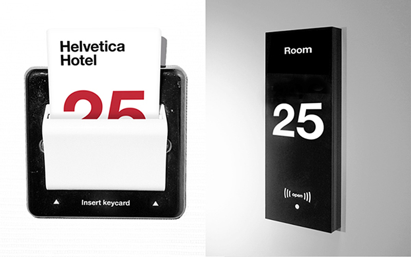
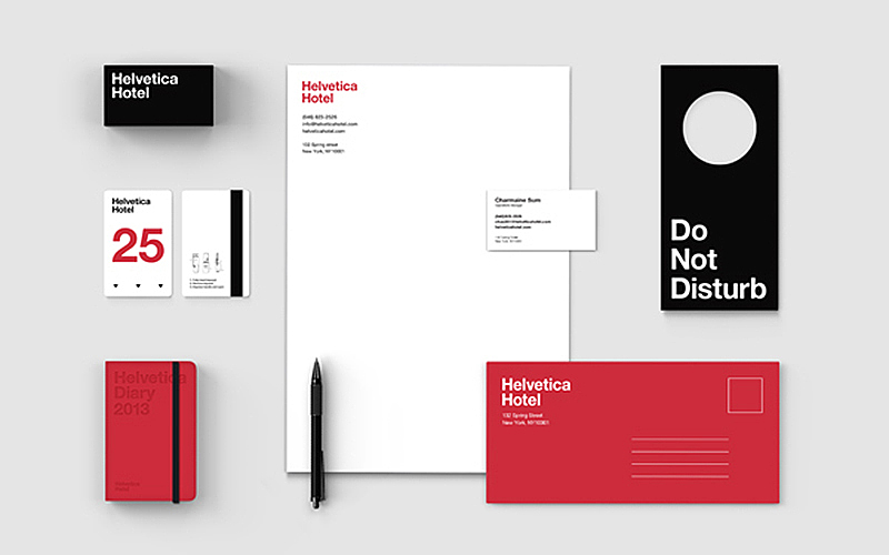
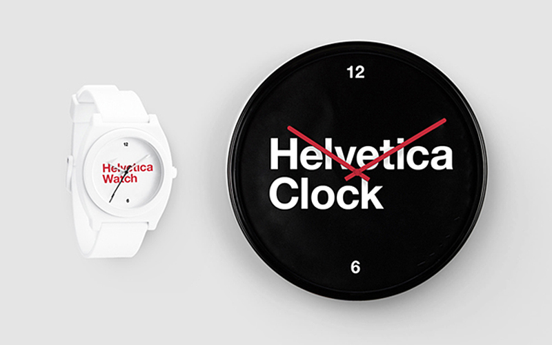
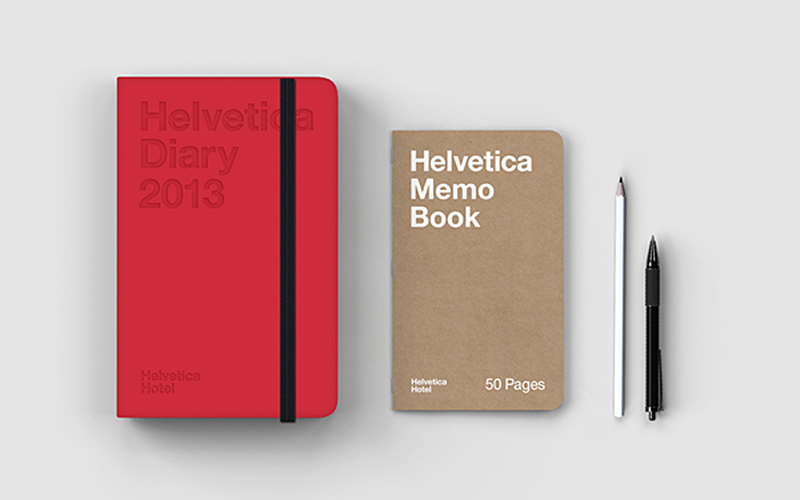
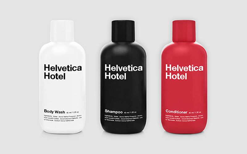
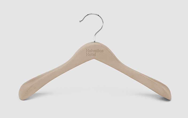
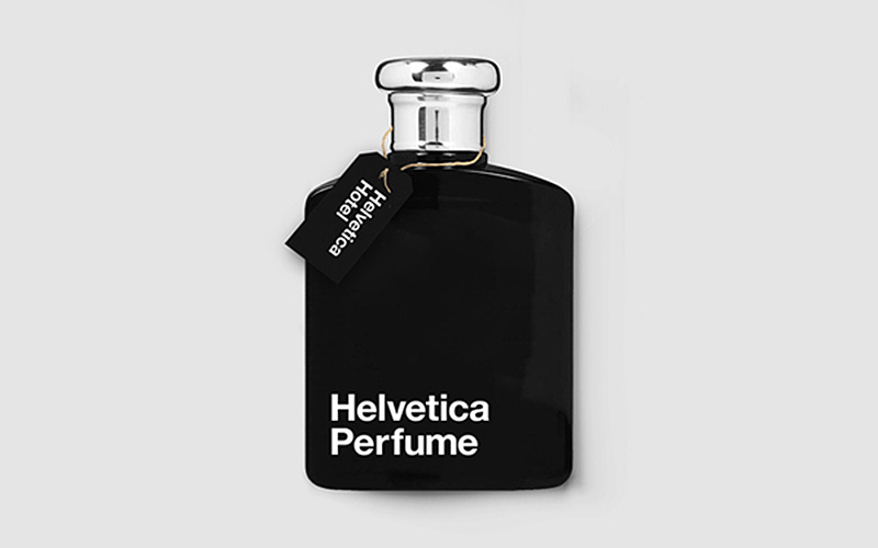
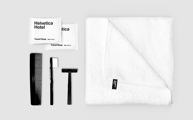
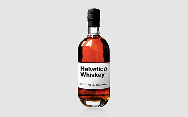
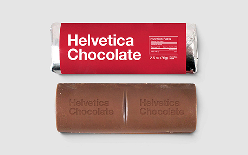
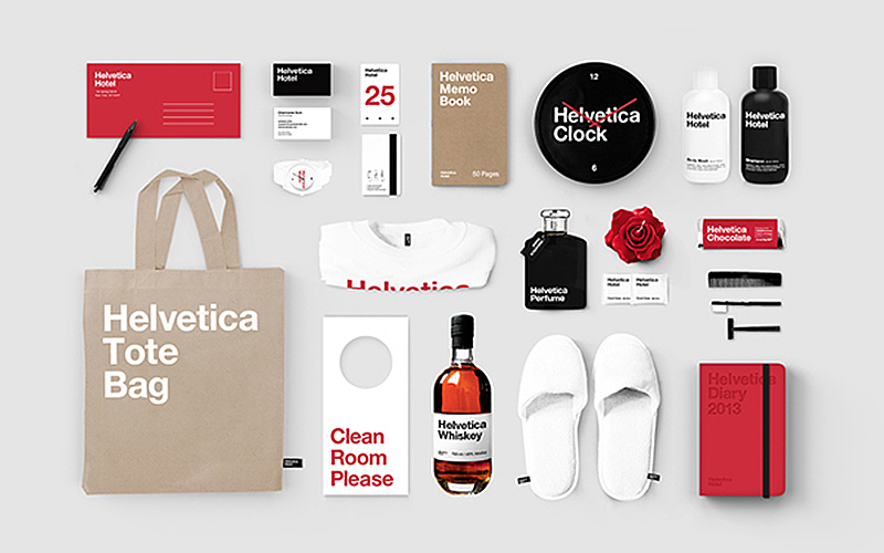
For an independent study, Jung Hwan (Albert) Son, a senior communication design student at Parsons the New School for Design, decided to create and brand a hip and trendy hotel – inspired by the Helvetica typeface. In addition to taking a look at his elements designed for his conceptual Helvetica Hotel, we go into the history of the typeface, and the documentary about it.
The Helvetica Hotel
Room keys, signage, wall clocks and stationary:
Toiletries, hangers and minibar items:
The clean sans serif font has been a favorite of designers since its inception, used for many recognizable logos and even inspiring a full length film.
History of Helvetica:
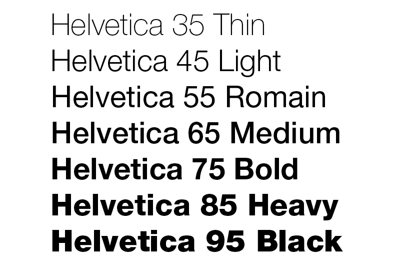
The Helvetica font was developed by Max Miedinger with Edüard Hoffmann in 1957 for the Haas Type Foundry in Münchenstein, Switzerland and quickly became an international hit in the graphic arts world. With its clean, smooth lines, it reflected a modern look that many designers were seeking. At a time when many European countries were recovering from the ravages of war, Helvetica presented a way to express newness and modernity.
“First learn a proper trade.” These were the words with which Max Miedinger’s father put an end to the debate on the future career of his 16-year-old son, who longed to become a painter. Instead, in the autumn of 1926, Miedinger junior began an apprenticeship as a type setter with the Zurich printing company Jacques Bollmann. Four years later, he knew for certain: “I want to be a designer, not spend the rest of my life fiddling with columns of type in galleys”. Evening classes with Johann Kohlmann at the Zurich School of Arts and Crafts confirmed his interest. Finally, in 1936, Max Miedinger was able to put his talent to professional use – as a typographer in the advertising studio of the Globus department store chain. There, over the ten years that followed, he created posters, newspaper advertisements, the corporate lettering and printing for in-house use.
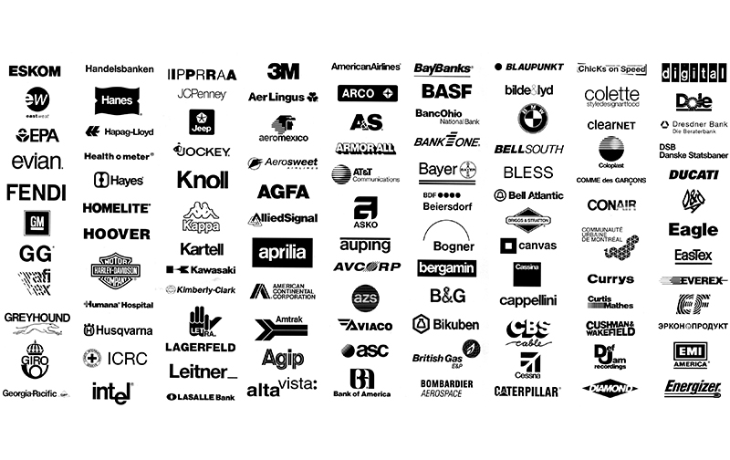
Once Helvetica caught on, the typeface began to be used extensively in signage, in package labeling, in poster art, in advertising—in short, everywhere. Innumerable corporate logos such as those of Lufthansa, Bayer, Hoechst, Deutsche Bahn, BASF and BMW use the font. Inclusion of the font in home computer systems, such as the Apple Macintosh in 1984, only further cemented its ubiquity.
The Helvetica Documentary
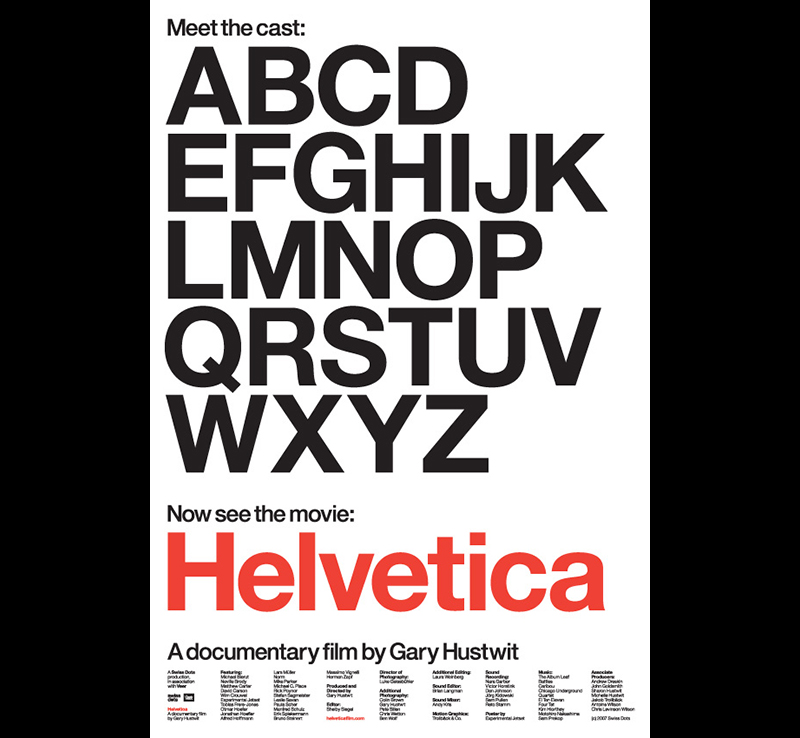
Directed by Gary Hustwit, Helvetica is a feature-length independent film about typography, graphic design and global visual culture. It looks at the proliferation of one typeface (which will celebrated its 60th birthday in 2017) as part of a larger conversation about the way type affects our lives.
You can stream, rent or buy the Helvetica Documentary here on Amazon Prime
In his own words, designer Albert Son says “Essential theme of the branding is based on the visual attributes of the typeface, which is neutral, clean, simple. As it is most beautiful when it is by itself, focus of the overall branding was on keeping everything simple and clean in terms of typography as well as use of colors. While reinterpreting essential hotel products in ‘Helvetica’ way, the brand also introduces bunch of unconventional items in a range of categories.”

