I like it. But not everyone else does.
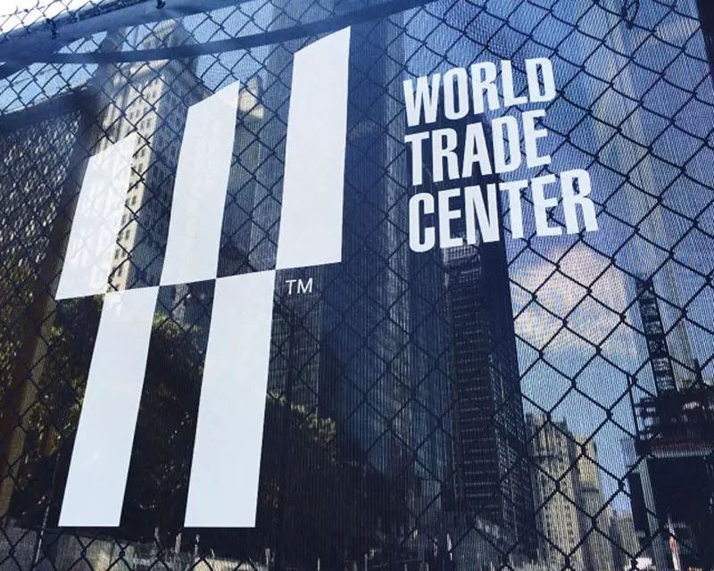
Landor’s New World Trade Center Logo
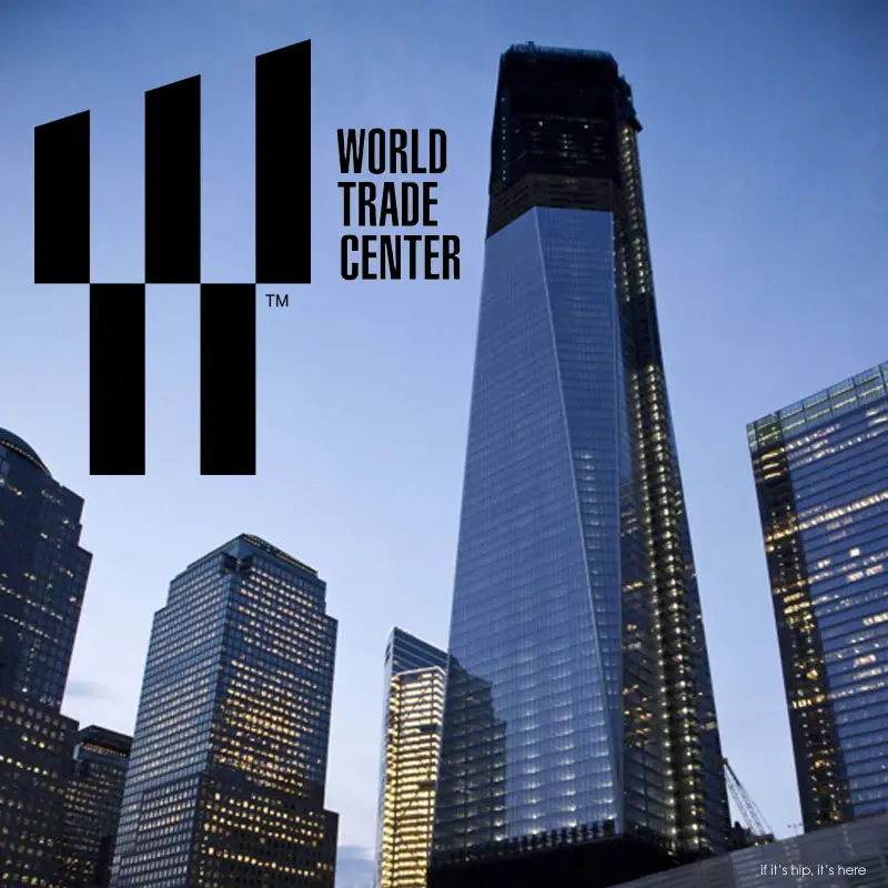
Some publications such as Fast Co. Design and The Independent are reporting that the new logo for the World Trade Center, created by design and branding firm Landor and Associates, is ‘confusing’ or that its multiple meanings may be lost on the public.
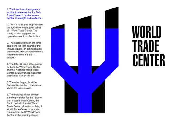
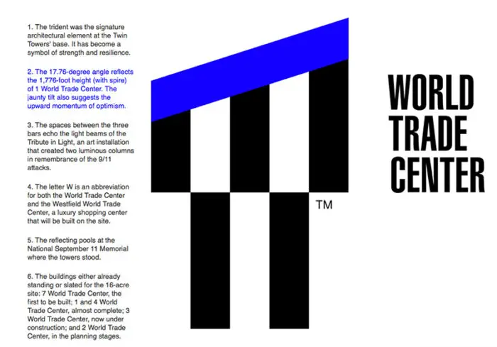
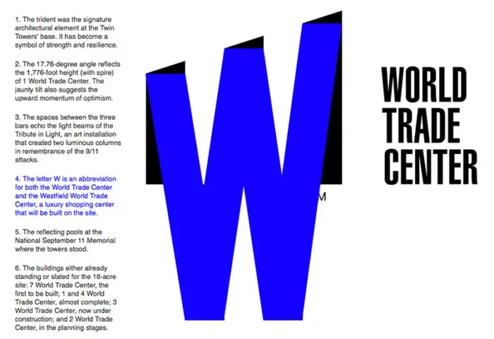
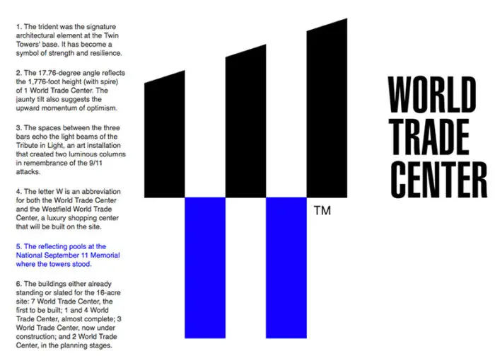
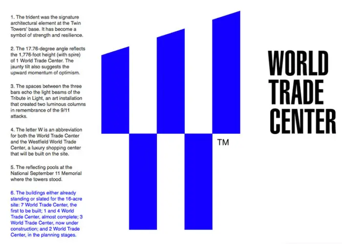
I have to disagree, but prior to saying why, here’s a look at the new logo with its six subtle meanings, called out in blue (courtesy of the now defunct BusinessWeek). Photos and other referential images are from yours truly:
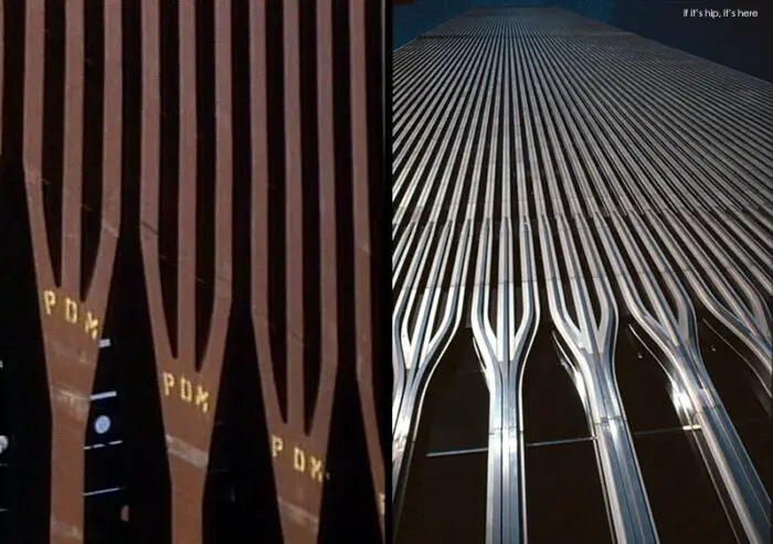
1. The trident was the signature architectural element at the Twin Towers’ base. It has become a symbol of strength and resilience.
Below are images of the original tridents during construction of and on the finished original twin towers:
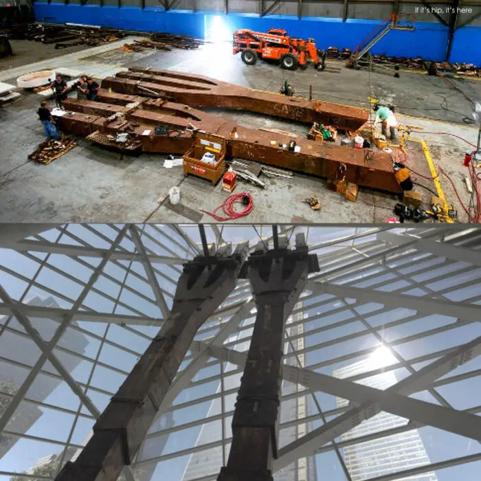
Two of the original tridents were salvaged after the attacks and are now installed in the 9/11 Memorial Museum as a somber remembrance:
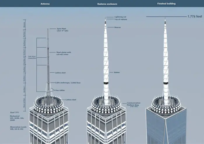
2. The 17.76 degree angle reflects the 1,776-foor height (with spire) of 1 World Trade Center. The jaunty tilt also suggests the upward momentum of optimism.
Diagrams of 1 WTC building’s spire:
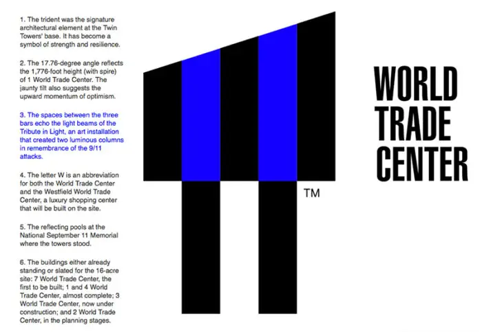
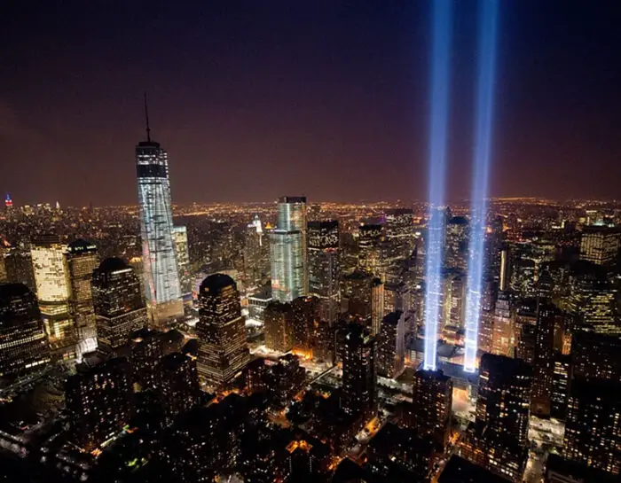
3. The spaces between the three bars at the top echo the light beams of the Tribute In Light, an art installation that created two luminous columns in remembrance of the 9/11 attacks.
The Tribute in Light marked the twelfth anniversary of the terrorist attacks at the World Trade Center, on Sept. 11, 2013 in New York City:
above photo by Noam Galai / Getty Images
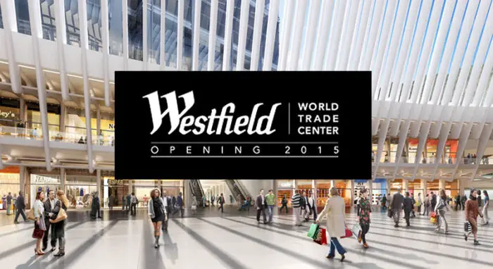
4. The letter W is an abbreviation for both the World Trade Center and the Westfield World Trade Center, a luxury shopping mall that will be built on the premises.
Westfield, together with the Port Authority of New York and New Jersey, is developing a 365,000 square foot shopping and dining complex in Manhattan’s iconic World Trade Center. The project will feature multiple levels including the WTC Transportation Hub and concourses that run throughout the entire World Trade Center site. Westfield World Trade Center will offer a world-class shopping experience which captures the essence and character of Lower Manhattan and the City of New York. Area: 365,000 sqf.
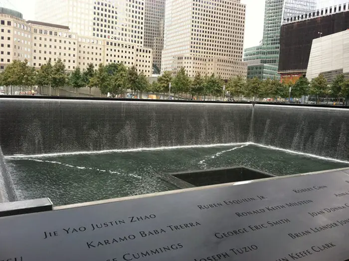
5. The two bars at the bottom represent the reflecting pools at the National September 11 Memorial where the twin towers stood.
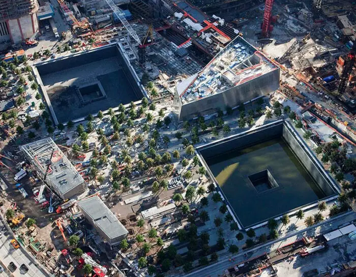
Michael Arad and Peter Walker’s reflecting pools, formally called “Reflecting Absence,” are two sunken black granite square voids which represent the footprints of where the original twin towers stood.
The reflecting pools bear the engraved names of those lost in the tragedy:
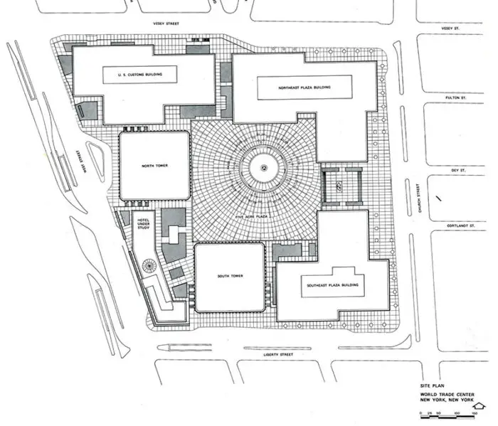
6. Lastly, the five bars stand for the five buildings (some constructed, some still in progress) that will make up the complex
The site plan:
About the five Office Towers:
• One World Trade Center
With its shimmering glass curtain walls and towering antennae, One World Trade Center will soar a symbolic 1,776 feet skyward to become America’s tallest building. Designed by David M. Childs of Skidmore, Owings & Merrill, the 2.6-million-square-foot building will include office space, an observation deck, world-class restaurants, and broadcast and antennae facilities.
• 2 World Trade Center
A sparkling glazed crystalline form and diamond-shaped summit will create a bold addition to the New York skyline. Designed by Foster and Partners, the 88-story 2 World Trade Center will be the second-tallest skyscraper in New York City. Located east of the proposed performing arts center and north of the WTC Transportation Hub, 2 WTC will rise to 1,349 feet and be topped by an 80-foot antenna.
• 3 World Trade Center
3 World Trade Center will be the third-tallest building on the World Trade Center (WTC) site. Designed by Richard Rogers of Rogers Stirk Harbour + Partners, the tower will be situated at the center of the various buildings around the memorial.
• 4 World Trade Center
A light, ephemeral vision, Tower 4 (150 Greenwich Street) will face directly onto the World Trade Center (WTC) Memorial Park from the west. Rising 977 feet. by Maki and Associates, the 72-story tower is intended to assume a quiet but dignified presence at the site.
• 7 World Trade Center
Completed in May 2006, 7 World Trade Center serves as flagship for the World Trade Center site, a touchstone of quality and sustainable design. The rebuilt 52-story, 1.7-million-square-foot office tower yields a tenant directory that includes Silverstein Properties, Moody’s Corporation, WilmerHale, WestLB, Ameriprise Financial, and Mansueto Ventures, publisher of Fast Company and Inc. magazines. The building is developed, owned, and managed by Silverstein Properties.
I think the six meanings, obvious or not, are valid substantiation for the design. Landor knows what they are doing. They have designed some of the most enduring and recognizable logos of all time for such brands as Levis, Pepsi, World Wildlife Fund (WWF), Frito Lay, FedEx, Cotton, Northwest Airlines, Bank of America and on and on.
This new ‘mark’ or ‘logotype’ is yet another a design that is iconic, timeless, easy to reproduce, works large or small and is, for the most part, unique enough not to be confused with any other. It’s even designed in such a manner that after years of exposure and familiarity, the text can be dropped. That meets more criteria for a good logo than most.
Does one have to know the meaning behind a logo for it to be effective?
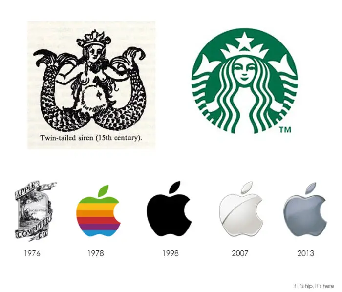
As to whether or not people can recognize or have any knowledge of the references that went into designing the new WTC logo, does that really matter? How many people know the origin of the Starbucks Siren/Mermaid or the exact thinking behind the iconic Apple logo and it’s evolution.?
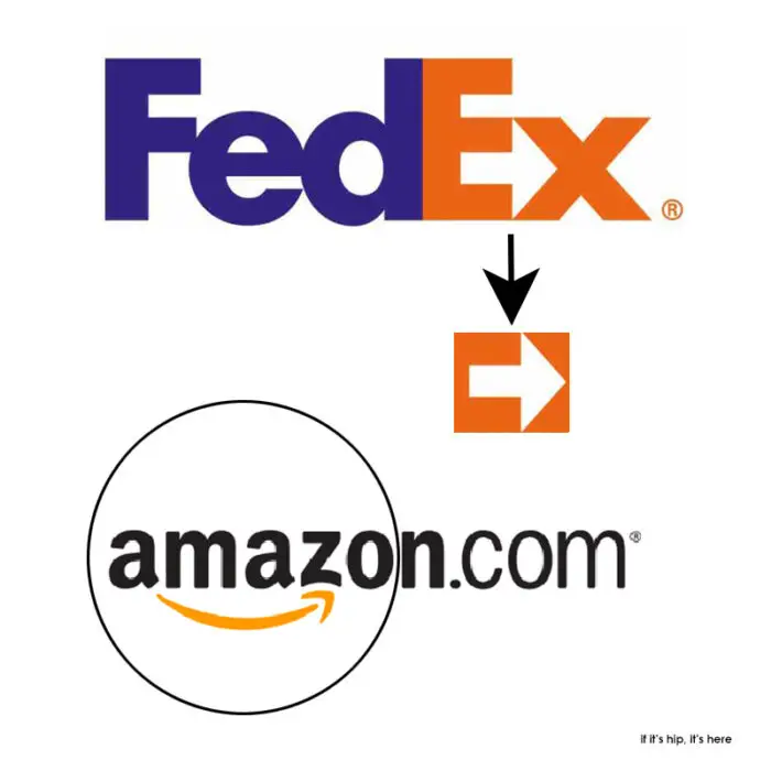
And there are still tons of people out there who don’t even see the ‘arrow’ in the Fed Ex logo or the smile in the Amazon logo.
That said, I like the WTC logo. I think it has all the attributes of a logo that can stand the test of time. All we can do is wait and see.
Landor
Information and images courtesy of BusinessWeek and WTC
