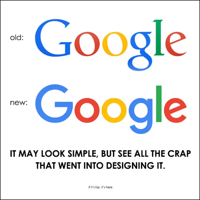
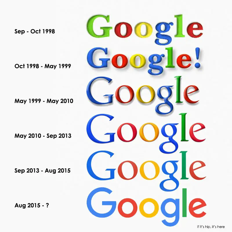
Yesterday Google revealed a new logo. The 6th since 1998. Did you notice? Most people will see the new, redesigned Google logo and not even realize they are looking at a new logo. Of course, the fact that it’s now animated in most instances, will be hard to miss. But still, very few will notice – or even care.
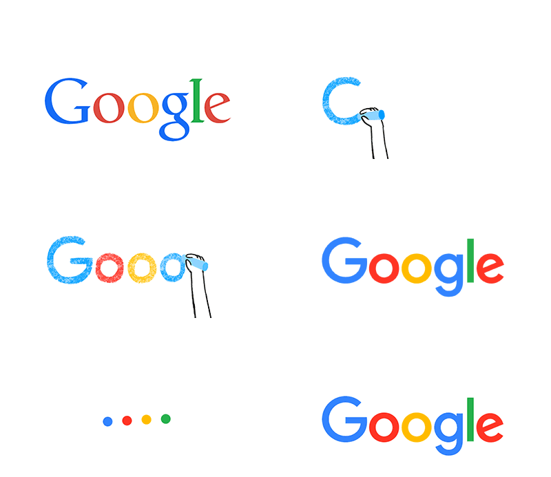
Redesigning The Google Logo
Particularly observant types will catch the change and opinionated designers (what designer isn’t?) will either immediately love it or hate it. But very few non-designers will believe how much work – thought, time, meetings and endless discussions and critiques go into logo design.
You may not care whether or not Google updates their logo, but you’ll get better insight as to how hard designers work when you read this.
The Google logo revisions and redesigns over the years:
The following is reproduced, with some changes, from an article by Alex Cook, Jonathan Jarvis and Jonathan Lee for Google:
Early this year, designers from all across the company, including Creative Lab and the Material Design team, convened in New York for an intense, week-long design sprint.
The Brief
A brief was drafted that identified the four challenges necessary to address:
1. A scalable mark that could convey the feeling of the full logotype in constrained spaces.
2. The incorporation of dynamic, intelligent motion that responded to users at all stages of an interaction.
3. A systematic approach to branding in our products to provide consistency in people’s daily encounters with Google.
4. A refinement of what makes us Googley, combining the best of the brand our users know and love with thoughtful consideration for how their needs are changing.
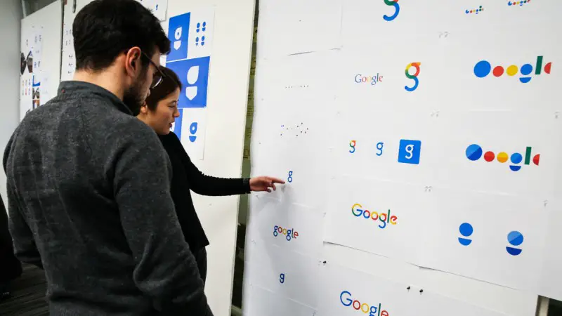
We started by distilling the essence of our brand down to its core—four colors on a clean white background—and built it back up. Stickies were stuck, pins were pushed, and beziers were animated. With the cutting room floor littered with hundreds of hours of design work, we set out with a few directions that excited us.
We shared the thinking with teams across the organization. Engineering, research, product, and marketing tested the ideas and evaluated their feasibility as we iterated on the design and rollout strategy. This collaborative process led to a system flexible enough to be used across our marketing materials and product work on any platform: three elemental states that make up a single logo.
The Elements
• Google Logotype: A sans serif logotype that retains our distinct multi-color sequence.
• Dots: A dynamic distillation of the logotype for interactive, assistive, and transitional moments.
• Google G: A compact version of the Google logo that works in small contexts.
Understanding the system
The thinking and design development goes much deeper than the core elements, and a spec was developed to help with consistency across teams working on a wide range of applications. The following examples are not comprehensive, but show a bit of the thinking that went into the system.
Logotype
The Google logo has always had a simple, friendly, and approachable style. We wanted to retain these qualities by combining the mathematical purity of geometric forms with the childlike simplicity of schoolbook letter printing. Our new logotype is set in a custom, geometric sans-serif typeface and maintains the multi-colored playfulness and rotated ‘e’ of our previous mark—a reminder that we’ll always be a bit unconventional.
The final logotype was tested exhaustively at various sizes and weights for maximum legibility in all the new digital contexts. To guide usage in screen and print, we developed standards to cover all aspects of the logotype including spacing, clearance rules, product lockups, and redline specifications for in-product treatments.
Google G Construction
The Google G is directly derived from the logotype ‘G,’ but uses increased visual weight to stand up at small sizes and contexts where it needs to share space with other elements. Designed on the same grid as our product iconography, the circular shape was optically refined to prevent a visual “overbite” at the point where the circular form meets the crossbar. The color proportions convey the full spectrum of the logotype and are sequenced to aid eye movement around the letterform.
Google Dots in Motion
The Google dots are a dynamic and perpetually moving state of the logo. They represent Google’s intelligence at work and indicate when Google is working for you. We consider these unique, magic moments. A full range of expressions were developed including listening, thinking, replying, incomprehension, and confirmation. While their movements might seem spontaneous, their motion is rooted in consistent paths and timing, with the dots moving along geometric arcs and following a standard set of snappy easing curves.
Color
The Google logotype benefits from whitespace between letterforms, but when colors are adjacent—as in the case of the Google G—they optically blend and can result in a darkening and dimming of the original value. We adjusted and pushed the vibrancy of the red, green, and yellow to maintain saturation and pop.
Implementation
Typography
In tandem with developing the logotype, we created a custom, geometric sans-serif typeface to complement the logo in product lockups and supporting identity materials. We call it Product Sans. The typeface design takes cues from that same schoolbook letter-printing style, but adopts the neutral consistency we’ve all come to expect from a geometric sans serif. This allows us to maintain an appropriate level of distinction between the Google logotype and the product name. The character set is complete with numerals, punctuation, accent and alternate characters, fractions, symbols, and supports extended Latin, Greek, and Cyrillic.
Product
Many of our products across Google will be releasing the update, but for most people, the very first experience of the new brand will be through Search. The Search UX and engineering teams worked hard to deliver the first embodiment of the text and voice queries, demonstrating the identity’s full range of expression.
Broader distribution
As the design evolved, engineering developed a unique approach for asset generation, version control, and self-service distribution across our code base. Using pixel-perfect SVGs for base assets, we automatically generated thousands of vector-based variants to satisfy size, color, and background requirements. These variants are then checked into our source control in a canonical location to avoid duplication and ensure that every team is using the most correct, up-to-date assets.
This helps us make the design pixel perfect everywhere it’s used, and it allows us to optimize these assets for size and latency, including building a special variant of our full-color logo that is only 305 bytes, compared to our existing logo at ~14,000 bytes. The old logo, with its intricate serifs and larger file size, required that we serve a text-based approximation of the logo for low bandwidth connections. The new logo’s reduced file size avoids this workaround and the consistency has tremendous impact when you consider our goal of making Google more accessible and useful to users around the world, including the next billion.
Beyond design
Design was only one part of the effort. The realization of the new identity required the collective work and diligence of hundreds of Googlers, in different roles, spanning the entire organization. They deserve huge credit for building and implementing the system down to the very last pixel.
As we move forward creating new products and experiences, we hope this work will continue to deliver the simplicity and delight you expect from Google—wherever new technology may take us.
Google Evolved video:
all information, images and animations are courtesy of Google
