![]()
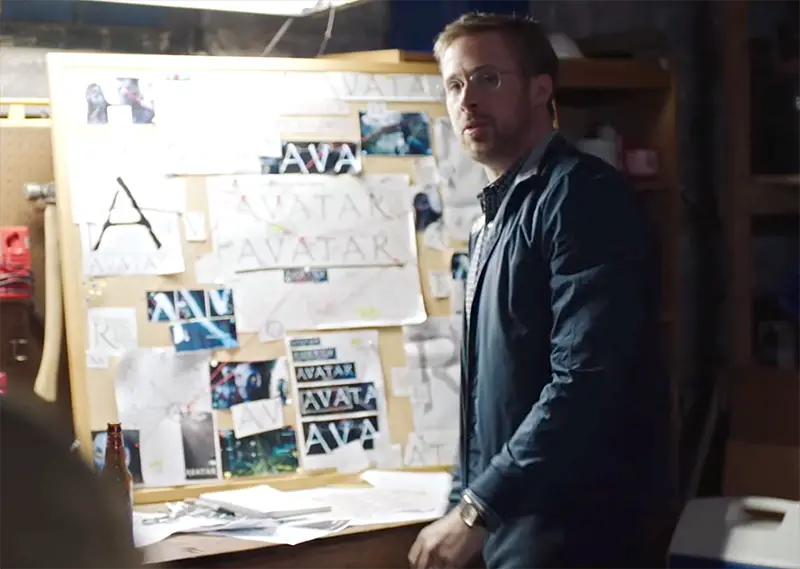
In what has got to be one of SNL’s funniest skits during a banner year for the television show, Ryan Gosling continues to have nightmares over the now decade-old movie’s title typeface, Papyrus.
Ryan Gosling Still Haunted By Papyrus
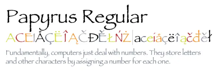
Papyrus was incredibly popular when first designed by Chris Costello in 1982 and released by the Letraset foundry in 1983. The font was initially designed as a portal to the past, representing what the English text of today would have looked like written on ancient papyrus scrolls. The blend of Roman lettering and calligraphy was considered quite effective at that time. However, a combination of overuse and misuse has shattered its reputation, and it’s now considered one step up from clip-art.

When James Cameron elected to use it for the Avatar logo and subtitles for his then ground-breaking movie in 2009, it received a lot of guff and articles from disappointed designers and aesthetes. The text was so abhored, there were sites dedicated to it and tee-shirts made to mock it, such as Papyrus Watch and this t-shirt by Colony Studios.
Last night, in one of SNL’s funniest skits in decades, Ryan Gosling is still haunted by the poor design choice.
The skit was written by the brilliant staff writer Julio Torres, who back in May tweeted about the idea:
Every day I wake up and remember that Avatar, a huge international blockbuster, used Papyrus font for their logo and no one stopped them.
— julio torres ~* (@juliothesquare) May 23, 2017