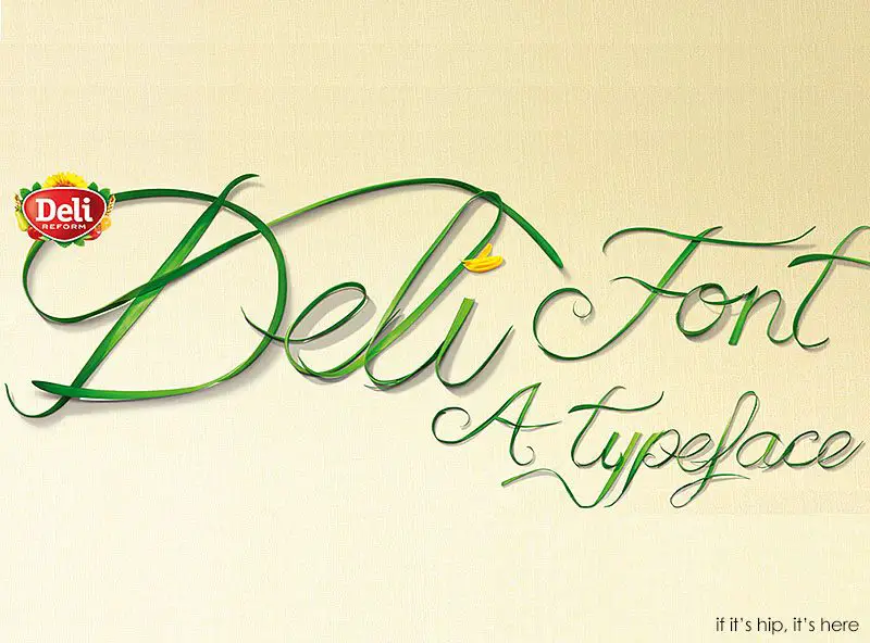
The relaunch of the Deli Reform brand focuses on the high quality of their vegetable margarine, its natural ingredients and its positive effect on a healthy diet. and utilizes a typeface design of real plants.
Typeface Design of Real Plants
The Deli Font is a typeface design of real plants, specially made by Dusseldorf agency and coincidentally named “Butter.” Created for a headline-based ad campaign for the butter brand, it demonstrates purity and simplicity by using typography based on real plants. Every single letter was made from a photograph of real plants.
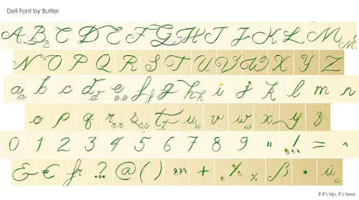
For later communications, they expanded the typeface to offer everything else needed for a complete font:
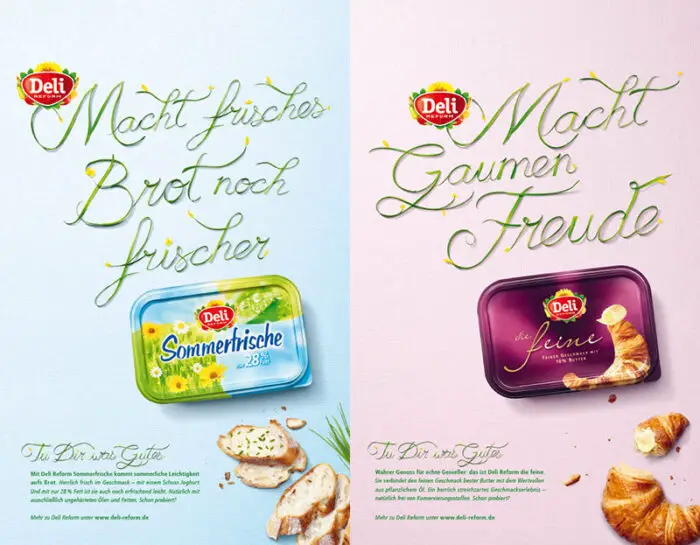
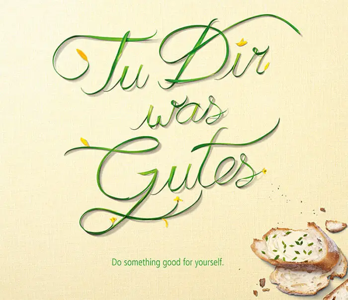
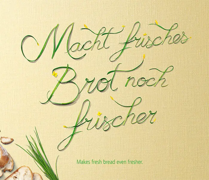
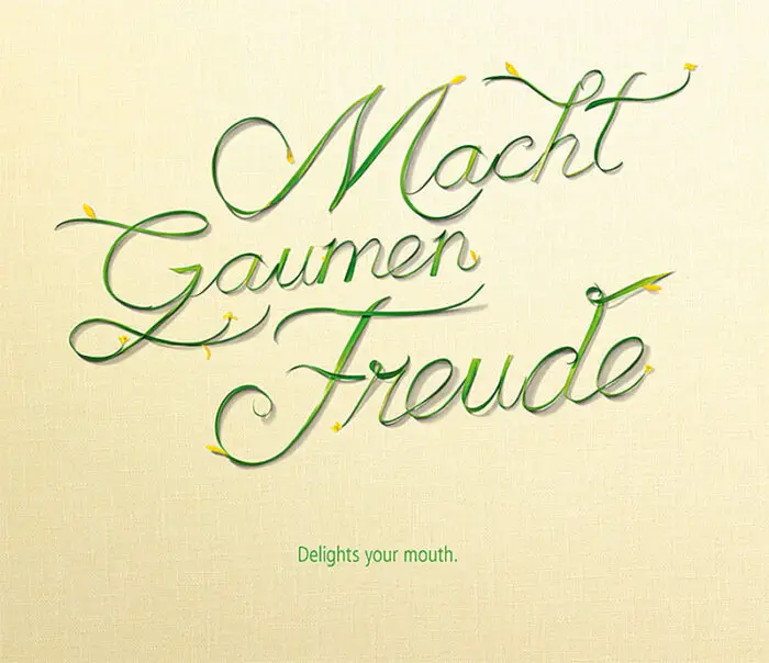
More examples of the font in use as headlines for print ads
The Deli Font [Typeface]
Credits
client: Walter Rau Lebensmittelwerke GmbH, Hilter
design: BUTTER. GmbH, Düsseldorf
chief creative officer: Frank Stauss
creative direction: Patrick Hampel
photography: Jochen Arndt
styling: Nici Theuerkauf
account management: Sabine Bülow
production: Kathrin Wilde