![]()
The redesign of the logo for The Met is yet another uninspiring piece of work from Wolff Olins. I’m rarely so disappointed in a logo design that I actually blog about it, yet this is the third time I’ve felt compelled to write negatively about the logo designs from this firm.
Wolff Olins Redesigns The Met Logo
Wolff Olins redesigns The Met Logo and once again, I’m just not a fan. But by no means am I alone in my feelings. Along with many designers, I expressed my dismay at their ugly 2012 Olympics logo and shared my disappointment about their redesign of the New York Taxicab logo.
![]()
![]()
above:Logos for the NYC Taxicabs and the 2012 Olympics, both by by Wolff Olins, have been met with much criticism by well-known designers
Now here I am, yet again, about to bag on them about their recent redesign of The Met logo. And once again, many share my feelings as you can see here, here, here and here.
However, there are some who really like it. Jen Carlson for The Gothamist is one such example.
The Met is the colloquial term for New York’s Metropolitan Museum of Art, the largest art museum in the United States and among the most visited art museums in the world.
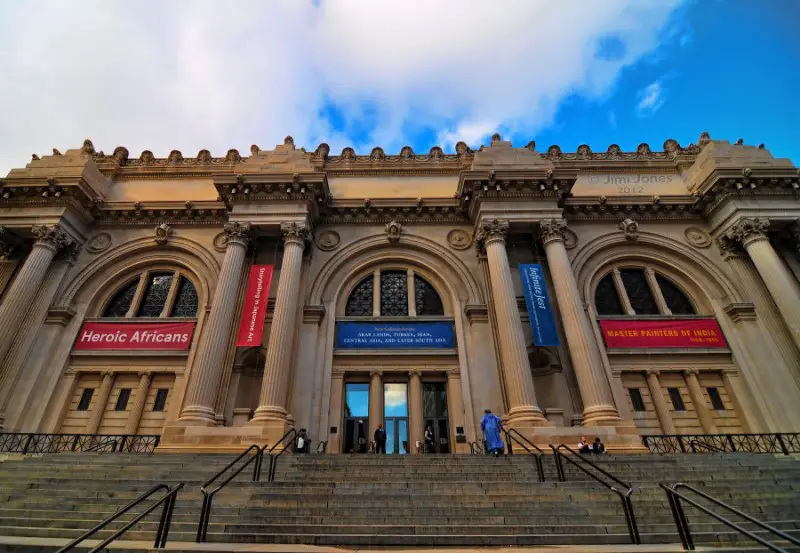
The architectural M, an adaptation of which has served as the logo for the museum since 1971, had great provenance. It’s an adaptation from De Divina Proportione, a book on mathematics written by Luca Pacioli and illustrated by Leonardo da Vinci composed around 1498 in Milan and first printed in 1509.
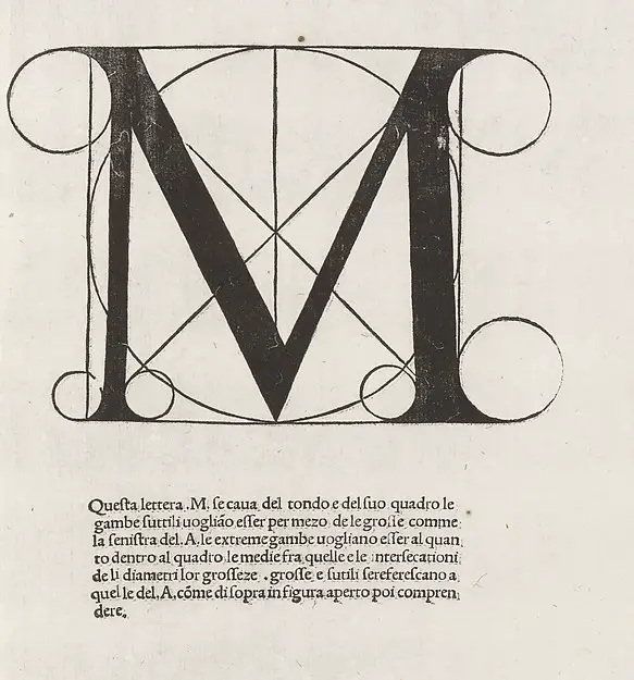
The Met logo featuring the architectural M, was most often represented in a circle, as shown below:
![]()
The new mark, below, was drawn by typographer Gareth Hague (who also created the font for the 2012 Olympics logo) and will replace the architectural M logo beginning March 1, 2016.
Wolff Olins says “The logo exploration was led by the choice of the new, more succinct name, The Met. The mark is a unique drawing inspired by the idea of making ‘connections’ — helping users connect ideas across time and culture, across the collection, between themselves and the art they interact with. The letterforms are connected together in bespoke ways and combine both serif and sans-serif letterforms — a deliberate move to incorporate both classical and modern ideas, a nod to the fact that The Met spans 5,000 years of art.”
The museum’s director, Thomas P. Campbell, shown below at a podium displaying the Metropolitan Museum of Art’s new logo is clearly feeling a bit under attack. He accompanied this photo with “Logo obsessed #zombies try to eat Met director @metmuseum” on Instagram.
Logo obsessed #zombies try to eat Met director @metmuseum
A photo posted by Tom Campbell (@thomaspcampbell) on
According to the New York Times, prominent designer Karim Rashid said of the new logo “In capital letters: ATROCIOUS. We’re talking here about a museum that’s all about history. So the best thing they could do is hang on to keeping their mark — or their logo — historic.”
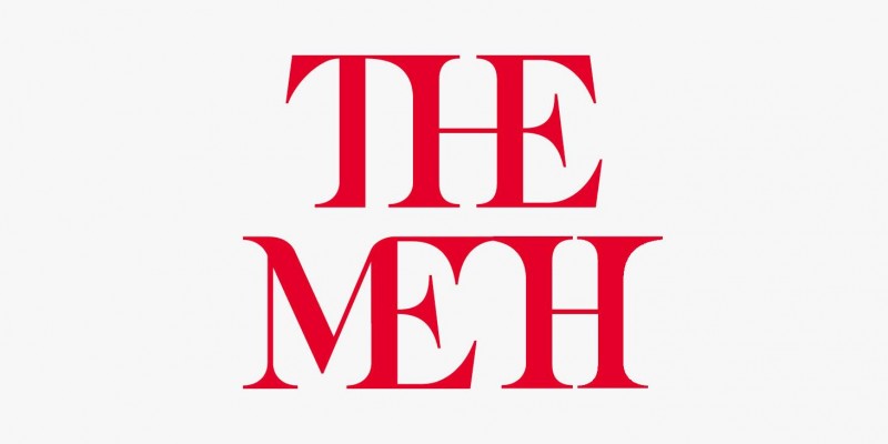
Copywriter and editor Jacqui Garcia-Bowman nailed many people’s feelings about the design with a little letter shifting:
Twitter uses certainly aren’t holding back:
THE MET logo forces a T to be as wide as an M or an M to be as narrow as a T. Cannot possibly work. Weird gaps, forced curvy shapes.#themet
— erik spiekermann (@espiekermann) February 21, 2016
So is the new #design trend to create an ugly logo to get a ton of publicity? #themetlogo #themet— Edgar Garcia (@eggner_g) February 22, 2016
When you break something that didn’t need fixing: https://t.co/RtGTqHLR7Q #themet #logodesign @Adweek pic.twitter.com/HRWeMcCd93
— Madeline Engler (@MadelineEngler) February 22, 2016
I’m with Wesley Stuckey on the spacing & proportions. A student could have done this for $25. #logodesign #theMet https://t.co/TapVFvMZzH
— Brooke Griffiths (@BrookeGDesign) February 19, 2016
I don’t have anything personal against the Wolff Olins firm who describe themselves as follows: “Our global teams of designers, strategists, technologists, programme managers and educators deliver deep, meaningful change across and beyond our clients’ organisations.” Nor do I personally know the designers who worked on the logos. But as someone with a degree in design and who has studied typography, I find this mark to have odd relationships between the letters and large spaces that make it look amateur and clunky. The thins are too thin and I keep wanting to nudge the word MET to the right a little because it isn’t visually centered. The previous mark, with its allusion to Da Vinci’s Vitruvian Man, seemed to encapsulate the historical aspects of art and design with a contemporary graphic treatment that was timeless.
The following statement was released by the museum last week:
Throughout its 146-year history, The Metropolitan Museum of Art has evolved to meet the needs of its audience. An unwavering part of the Museum’s mission is to reach and inspire the broadest possible community—locally, nationally, and internationally. We are proud, therefore, to reveal a new visual strategy that will create greater clarity and consistency in The Met experience and communication across all of its locations—The Met Fifth Avenue, The Met Breuer (opening March 18), and The Met Cloisters—and online.
above image of the logo extensions for The Met Breuer and The Met Cloisters courtesy of Brand NewNew designs will be put into use beginning March 1, and will include a clear graphic language comprised of custom fonts and colors. Our new logo no longer relies on symbols and, instead, is based on our commonly used name “The Met,” which has an immediacy that speaks to all audiences. It is an original drawing, a hybrid that combines and connects serif and sans serif, classical and modern letterforms. In this respect, it reflects the scope of the Museum’s collection and the inherent connections that exist within it.
There will also be a new map, way-finding, and advertising, as well as a clear, integrated presentation of The Met’s programming across print and digital materials. The website will debut a fresh design, with simplified navigation and a more robust infrastructure.
Our new look reflects a driving principle of our institution, and was chosen because it represents something simple, bold, and indisputable: The Met is here for everyone.
Mark Kingsly gives an extensive review of the new logo design along with much of the thinking and rationalization behind it on Brand New.
In all fairness to Gareth Hague, co-founder of Alias, he has created many wonderful marks you can see here.