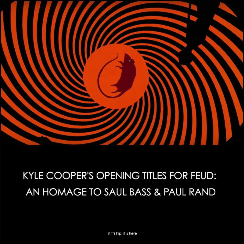
As I watched the premiere of Fox’s FEUD, the story of the rivalry between Joan Crawford and Bette Davis, I was blown away by the beautiful opening title sequence.
Kyle Cooper’s Opening Titles for FEUD
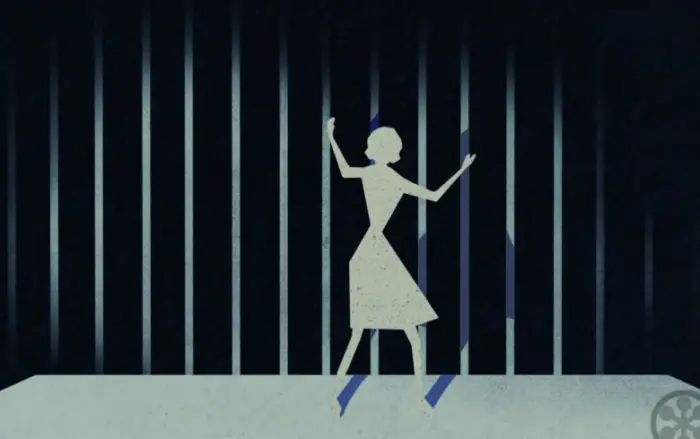
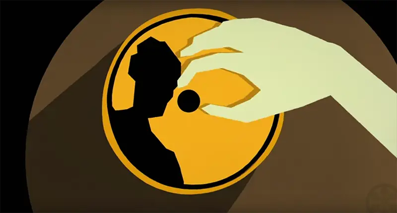
The animated sequence was clearly a nod to Saul Bass, the most reputed title designer of our time. But it was also inspired by another design legend, Paul Rand.
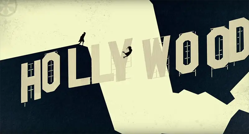
The 75-second opening credit sequence was created by Emmy-winning graphic designer Kyle Cooper, who has worked on more than 350 main title sequences including those for American Horror Story, Kong:Skull Island, The Spiderman movies, Zoolander, se7en and many more. Cooper actually studied independently with renowned American graphic designer Paul Rand at the Yale School of Art. Rand was a respected contemporary and friendly rival of Saul Bass, whose most well-known title designs are clearly referenced in FEUD’s opening sequence.
“They sent me, like, 120 stills so I could see what it was going to look like,” he said. “Based on that, I wrote the main title, pretty much as it appears now. We just made a couple of changes to it.” Cooper told IndieWire
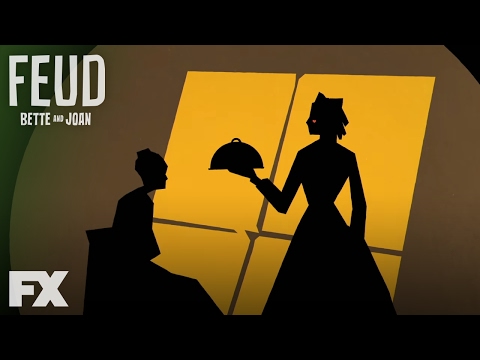
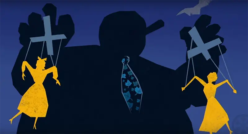
As for the color palette, Cooper told IndieWire, “Ryan (creator Ryan Murphy) said that he always wants it to be bright and have these period colors. Everybody says Saul Bass is the paradigm where these things, the patriarch of these sequences, but my teacher was Paul Rand, who was an American modernist graphic designer.
He has a book called ‘The Designer’s Art,’ and there’s a binding on it that has primary colors, but they’re not exactly primary. The blue has a little bit of purple in it. So there’s a little bit of purple in the blue behind the puppeteer. And the yellow has a little more red in it.
“He was doing a lot of work at that time that was more print-based. I think it influenced a lot of things that even Saul Bass was doing. He made a poster, he made a print ad for Ohrbach’s the department store that has a shade being drawn. And then a couple years later, Saul Bass made a poster for ‘Love in the Afternoon’ that was the same thing. Paul Rand used to talk to me about how Saul Bass was influenced by him. It was an interesting rivalry between those two guys. I was sort of tipping my hat to Mr. Rand as well I guess to Saul Bass as far as the animation style.
“And so at the end, almost a little bit before we were delivering, I went back and looked at a lot of Paul Rand’s work and I actually changed some of the colors,” said Cooper. “The blues, the reds, the yellows and the greens are sort of Paul Rand colors. That’s sort of an inside nod to him.”
ABOUT FEUD
FEUD: Bette and Joan, the first installment of Ryan Murphy’s FX anthology series, centers on the legendary rivalry between Joan Crawford (Jessica Lange) and Bette Davis (Susan Sarandon) during the filming of What Ever Happened to Baby Jane? and after filming ended. It explores how the two endured ageism, sexism, and misogyny while struggling to hang on to their careers. Premieres Mar. 5th on FOX.
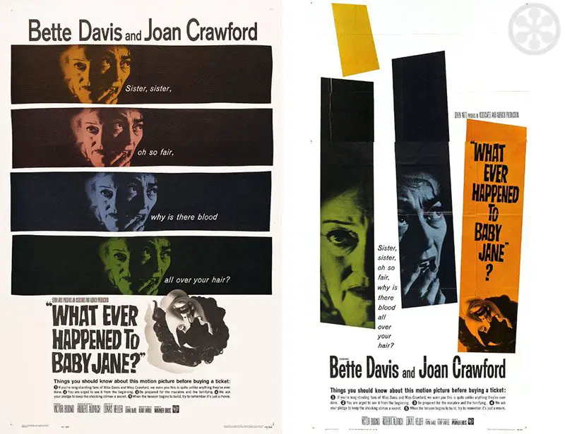
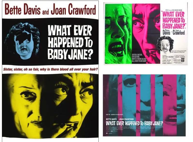
As a fun bonus FYI, take a look at these original movie posters for 1962’s What Ever Happened To Baby Jane? which are executed in the same mid-century modern graphic style:
Thanks to IndieWire for the quotes and information. Other information courtesy of imdb.com
See Some of Saul Bass’ most famous title designs here
See how Paul Rand changed American Design here