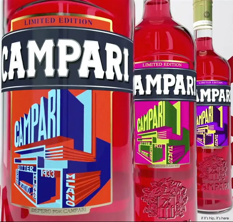
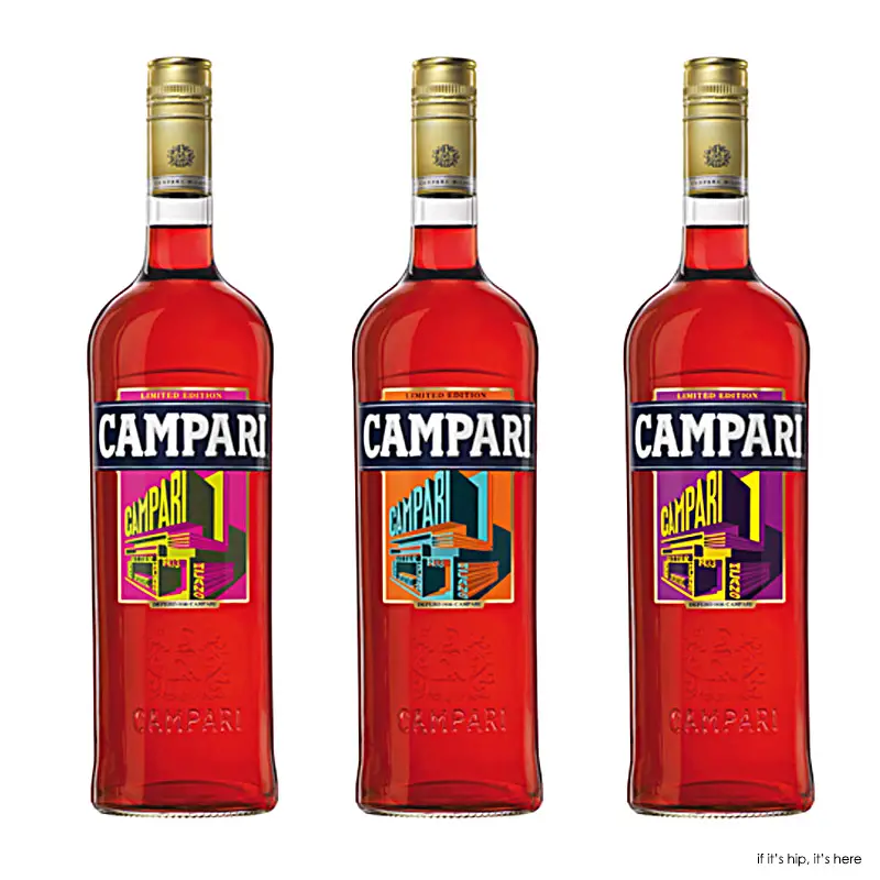
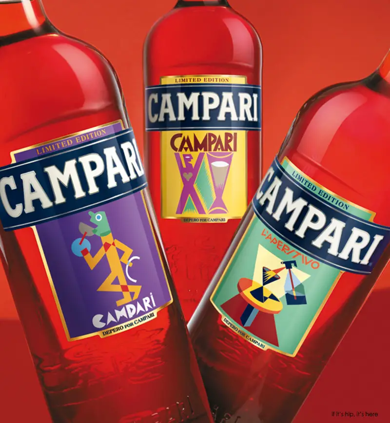
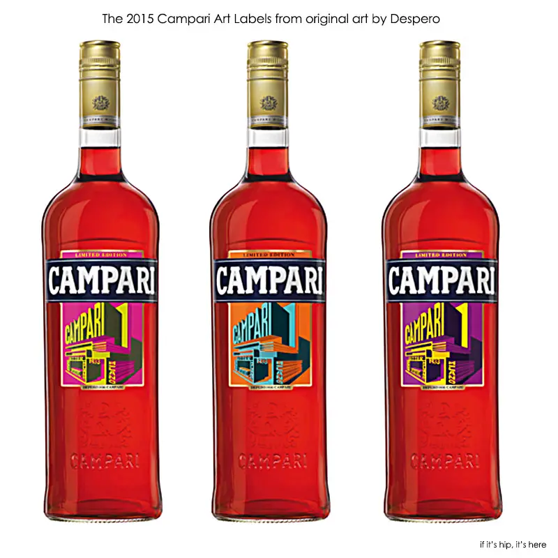
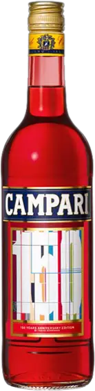
Campari has unveiled the latest in their series of limited edition Art Labels for 2015. This year the three labels feature updated versions of Italian Futurist Fortunato Depero’s iconic design for the Campari Pavilion drafted in 1931 for a 1933 international exposition to be held in Milan.
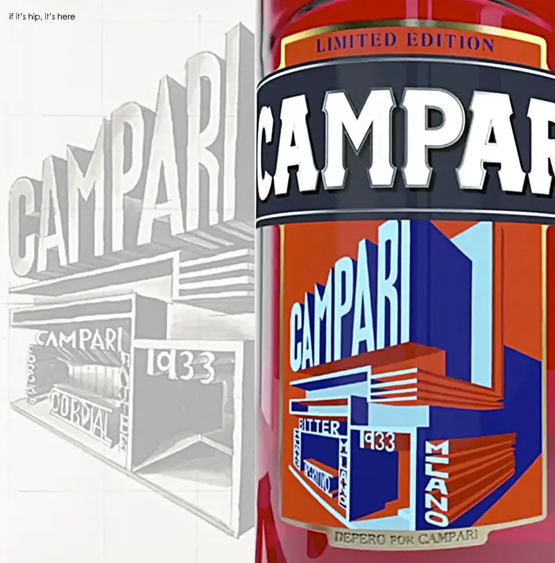
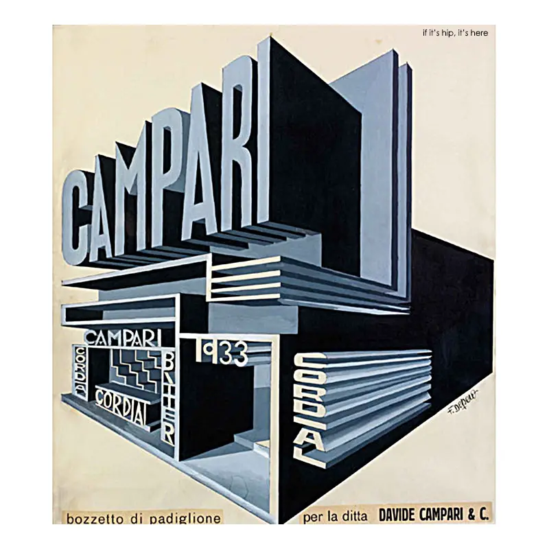
The Original Pavilion Sketch by Depero
The Campari Pavilion – The original 1931 sketch for the 1933 campaign that Depero created for Campari. It contains several variants to the final printed version (shown later in this post):
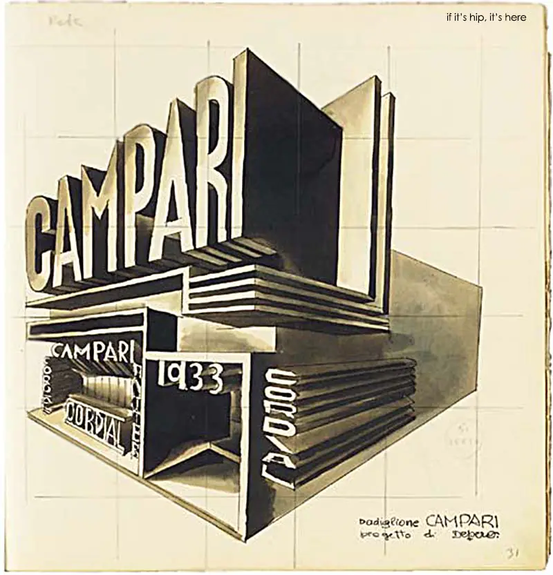
(above image courtesy of Christies sold for $71,622 USD at auction in 2004 )
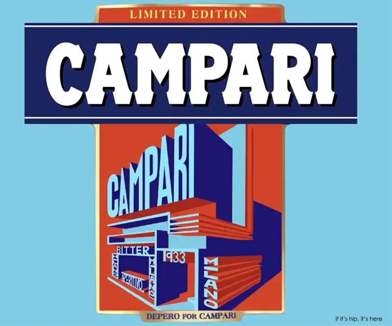
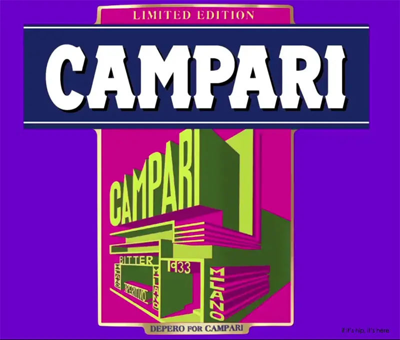
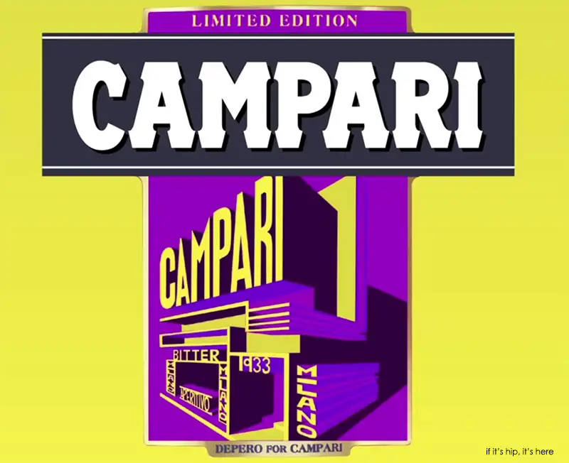
Collaborating with Pantone Global Color Authority expert, Francesca Valan, appropriate colors for the modernization of the labels were chosen. The original black and white sketch has been re-imagined with three different color labels; orange and cyan, magenta and lime green, and purple and yellow.
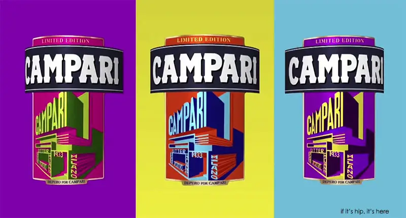
The three Art Labels were crafted to generate a standout effect similar to that of a neon sign, which allows Depero’s futuristic sketch to jump out further and brings the labels effortlessly into the 21st century.
The color schemes were added to reflect the global initiative which crowned 2015 as the “International Year of Light”, a movement which highlights “the importance of light and optical technologies”.
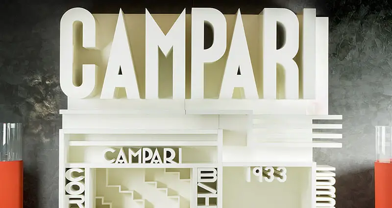
The later, final printed version of the original sketch:
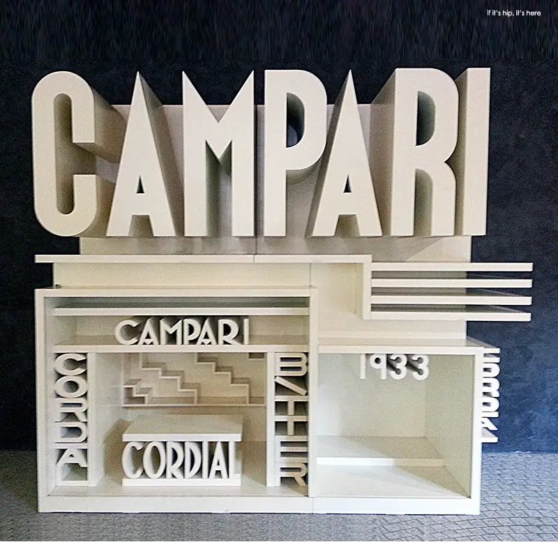
Life-Size Pavilion Replica in Campari’s Milan Headquarters
Though the original pavilion featured in Depero’s sketch was never brought to life, this 1960 life-size replica has been preserved in the Galleria Campari, within the brand’s incredible headquarters designed by Mario Botta and Giancarlo Marzorati in Sesto San Giovanni, Milan:
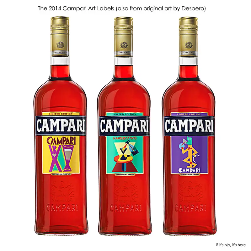
Last year’s 2014 Campari Art Labels also featured the work of Fortunato Depero and used his earlier drawings for the brand:
Campari describes the ongoing Art Labels project as follows:
An ambitious and innovative project which aims at confirming the link between the brand and Art in all its multiple forms.The label offers the artists the possibility to express their personal view and interpretation of Campari soul.
Inspired by the essence of the colour red and from the achievement obtained by this internationally famous aperitif, the artists created different artworks featuring diverse aesthetic identities bound up with the expression of a never-ending passionate beauty.
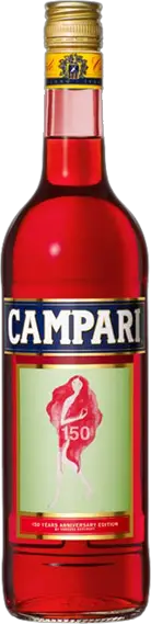
The project, representing the occasion to give a memento of 150th anniversary of Campari, is a starting point not a finishing post. Campari prove itself to be a continuously evolving brand, capable of dictating and interpreting new trends and cultures.
The Art Label Project goal is to create an evolutionary path, in which every label is a new milestone of a prismatic mosaic spreading the Campari esprit.
ALL THE PREVIOUS CAMPARI ART LABELS (first launched in 2010 to celebrate 150 years of Campari)
By FORTUNATO DEPERO, 2014 & 2015
By UGO NESPOLO, 2012

Paying homage to the famous Leonetto Cappiello’s “Spiritello”, Italian artist Ugo Nespolo has reinterpreted the famous artwork for the Campari’s Limited Edition 2012. The label is designed to celebrate Campari’s love of art. By bringing a colourful and eye-catching twist to this classic, as well as a contemporary edge, the aim of the Campari Limited Edition is to offer an exclusive work of art in an approachable fashion.
By Romero Britto, 2010
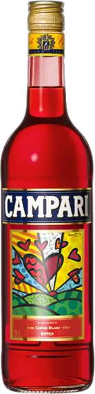
Romero Britto creates contemporary masterpieces that evoke a spirit of hope and convey a sense of warmth. “As soon Campari commissioned me to create a special label, I thought about the way the brand has reinvented itself over the years, and the intense emotion that it always transmits. This is why I have chosen to adapt the work of art ‘New Day’ featuring the sunrise, a newborn day, together with one of my signature elements, the heart, to illustrate this. I believe art is too important not to share, and with this label I wanted to show that Campari is also too important not to share” states Britto.
By AVAF, 2010
Assume Vivid Astro Focus (AVAF) label themselves “an international art collective with artists born anytime between the 20th and 21st centuries in various part of the world and nomads”. Its creation portrays a strong, independent female who is a combination of jass singer Nina Simone and the Egyptian queen Nefertiti. “We wanted to enrich the Campari female world – explains AVAF – to create something like a goddess, an icon.”
AVAF has a little secret: the one spokesman who appears in public for the collective wears a mask to conceal his identity.
By TOBIAS REHBERGER, 2010
His Campari label is based on the concept of Campari as a magic potion due to its red colour and summarized by its iconic label, in his proposal deconstructed and rebuilt with the bright colours he frequently uses in his artwork. “My work is abstract and it is open to various interpretations, like Campari. Similarly to my work, a Campari is like no other existing drinks: it is unique and well recognizable even when mixed in cocktails. My works are alike for their uniqueness” explains Rehberger.
By VANESSA BEECROFT, 2010
This artist, famous for her performances and watercolors, started to acquire international fame thanks to her striking live performances and the videos and photos documenting them. In this project Vanessa Beecroft used the female image for her artistic interpretation of Campari. Consistent with much of her art, the ethereal female has a fantastic head as red as the glass of Campari that she is holding. “A symbol of beauty, elegance and charm, gifts that Campari has been giving to the public for 150 years” states Beecroft.
Visit Campari’s Online Gallery for several other vintage works created in honor of the brand.